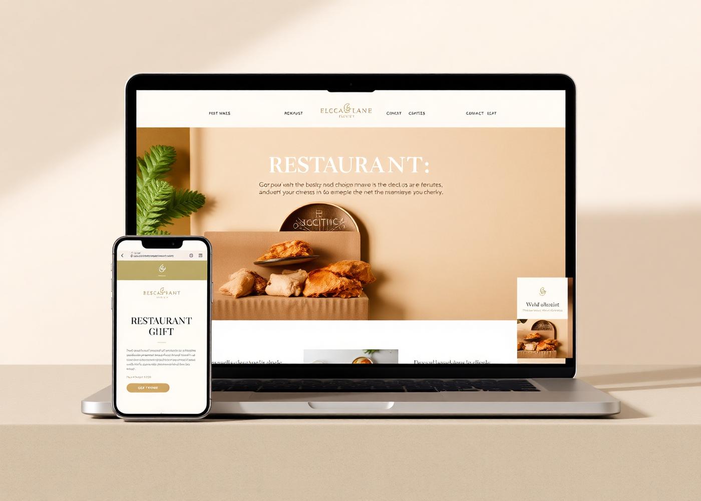
RestaurantConcept Project
Osteria Vista
Before
A single outdated page with no menu and no way to book a table.
After
An editorial site with a living menu, reservations, and the room's actual atmosphere.
Concept projects created to demonstrate our approach — each one shows the kind of shift a considered redesign makes.
A single outdated page with no menu and no way to book a table.
An editorial site with a living menu, reservations, and the room's actual atmosphere.
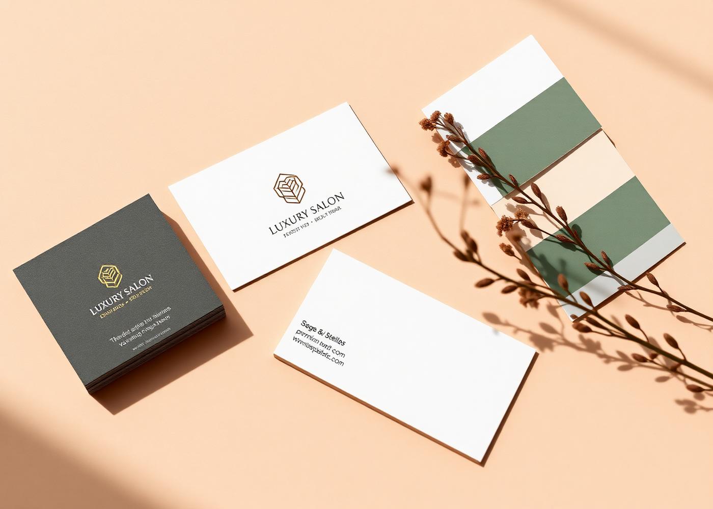
Three different logos, four fonts, and pricing hidden in a photo caption.
One clear identity, a legible service list, and booking in two taps.
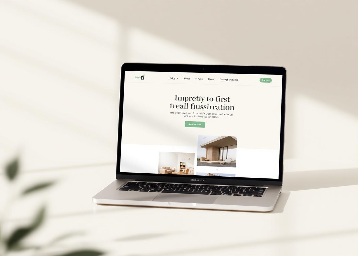
A template that looked exactly like every other agent in the county.
A distinct presence with neighbourhood guides and steady inbound leads.
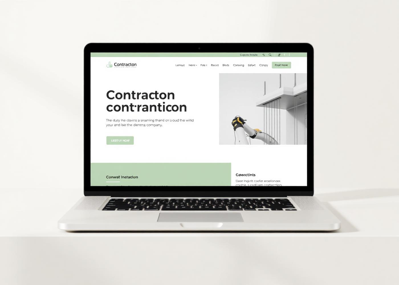
Finished work buried three clicks deep, quotes requested by phone only.
Project-first layout with photography up front and a quote form that gets used.
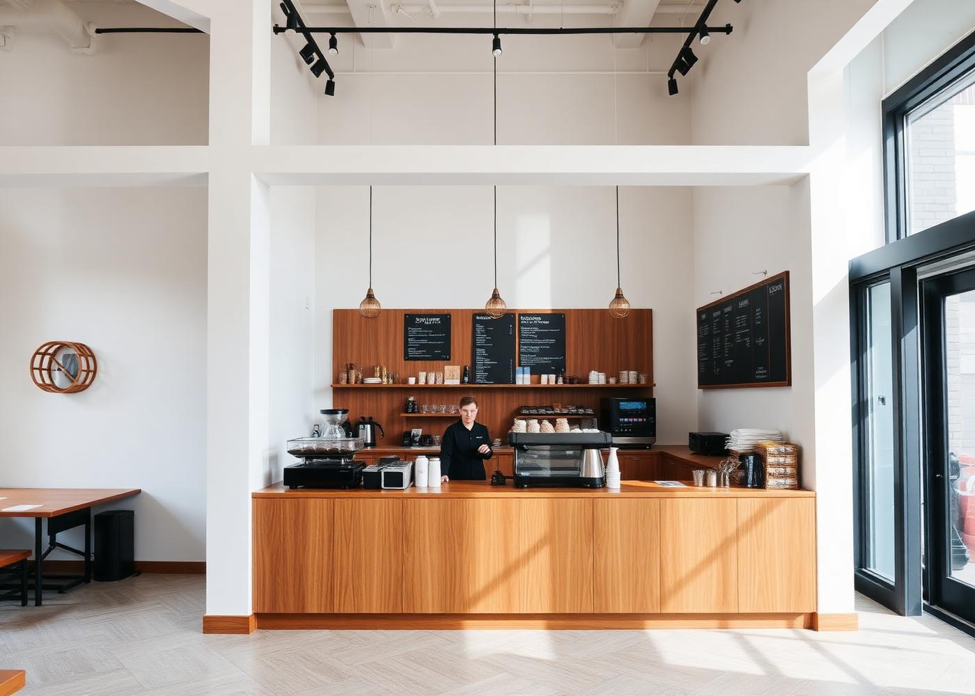
An Instagram bio doing the work of an entire website.
Hours, location, wholesale, and story in one place customers can actually find.
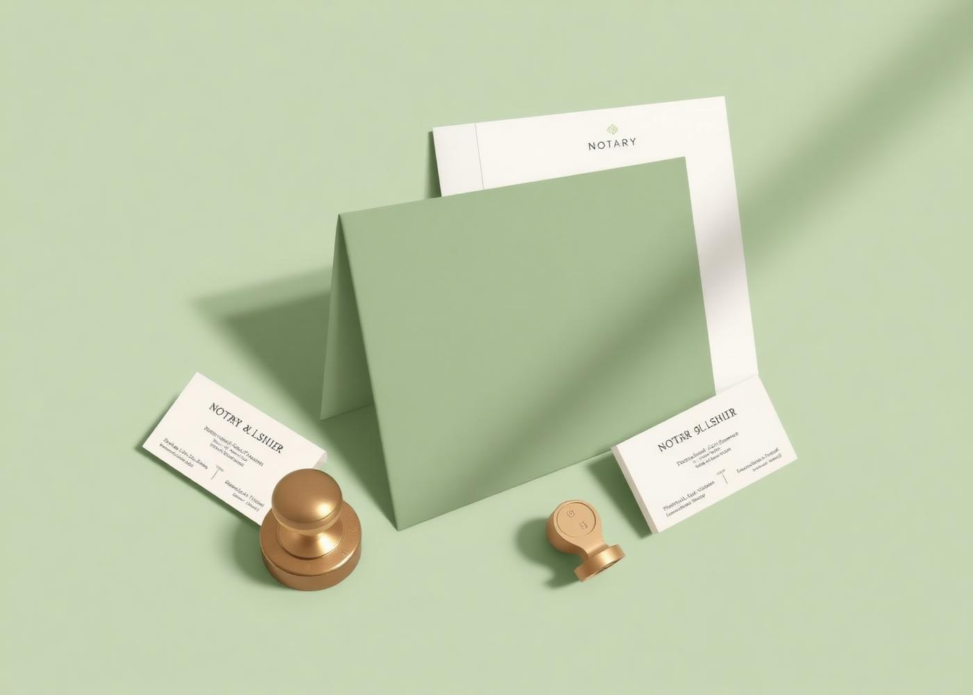
Clip-art logo, flyers made in a word processor, no consistent contact details.
A refined mark, printed collateral, and signage that reads as licensed and serious.
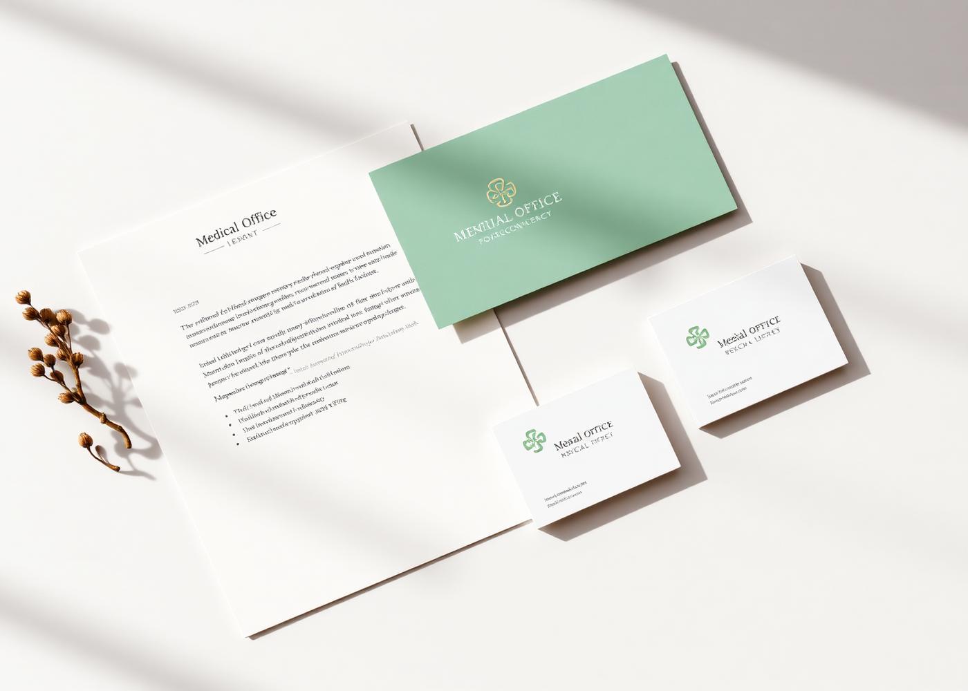
Clinical, cold, and impossible to tell apart from the practice next door.
A warm, trustworthy identity carried across the site, forms, and waiting room.
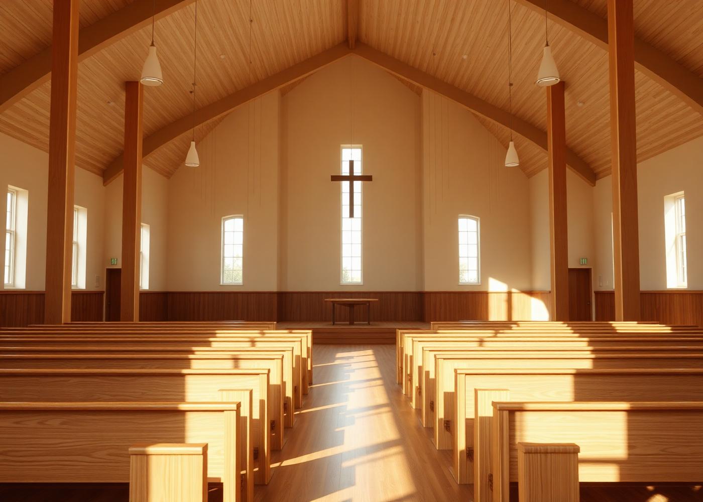
Service times last updated two years ago and no clear place to start.
A calm site with current times, a plain welcome, and easy first-visit answers.